
This article provides general setup information, not medical advice. Persistent or worsening symptoms should be discussed with a qualified clinician. See the HubWin health disclaimer.
Monitor color temperature for office work is a setting to evaluate by task, not one perfect number that suits every desk. A warm mode changes the apparent white of documents and photos. Brightness, contrast, room lighting and glare can make a larger practical difference than simply moving a color slider.
For routine email and writing, a gentle evening adjustment may be a preference. For photo editing, design review or brand colors, maintain a documented color workflow instead. This guide is informational, not a treatment for eye symptoms. See the HubWin health disclaimer if discomfort is involved.
Understand what the color mode changes
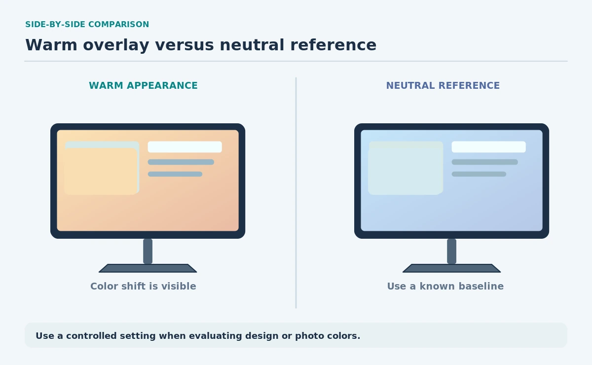
Color temperature describes the visual balance of warm and cool white in a display mode. A warmer preset often makes white appear more amber; a cooler preset can look more blue. This changes the appearance of images even when their underlying file has not changed.
Monitor menus may offer named presets such as Standard, Warm, Cool or Custom. Those names do not guarantee a common calibrated output across brands. Record the original setting and do not assume that two displays with the same label will match.
| Control | Main effect | Good use case |
|---|---|---|
| Color temperature / preset | Warmer or cooler white balance | Visual preference or defined workflow |
| Brightness | Screen luminance | Match changing room light |
| Night light | Warmer scheduled overlay | Optional evening appearance |
| Color profile / calibration | Color-managed output | Critical visual work |

Do not mix up temperature, brightness and glare
Brightness affects how luminous the screen looks in the room. Glare comes from reflections and bright surroundings. Color temperature affects color balance. Change one at a time so you know which adjustment actually improved the desk setup.
OSHA recommends placing displays to reduce overhead glare and near windows. That layout problem will not disappear simply because the image is warmer. Move a reflection, adjust a lamp or use the display controls before attributing every harsh-looking screen to color temperature.
Use Windows Night light with realistic expectations
Microsoft documents Night light under Settings > System > Display, including a strength slider and scheduling options. The mode makes the display warmer, but it is not a color calibration procedure. Microsoft also notes that the feature may be unavailable with certain display drivers, including some DisplayLink configurations.
If you do color-critical work, switch off temporary warm overlays during evaluation. Check the operating system’s color profile settings and the monitor’s documented preset. A screenshot viewed later on another device will not reveal the original room lighting or exact display balance.
| You need | Check | Avoid |
|---|---|---|
| Readable documents | Comfortable brightness and contrast | One “magic” color temperature |
| Consistent design color | Known monitor profile and workflow | Judging color with Night light on |
| Two-screen visual match | Same controlled viewing conditions | Assuming preset names match |
| Less window glare | Screen angle and nearby lighting | Trying to fix reflections with tint |
Compare modes with a fixed reference
Open a neutral gray image, a page with black text on white and one familiar photograph. Keep the chair, viewing distance and room light fixed while you compare two presets. Look for unwanted color tint in the gray and for any loss of detail in darker areas.
Return to a known baseline after the comparison. If you use two monitors, evaluate them separately because a shared mode label can hide different panel behavior. For print-matching or professional grading, follow a measured calibration workflow rather than relying on a visual guess.
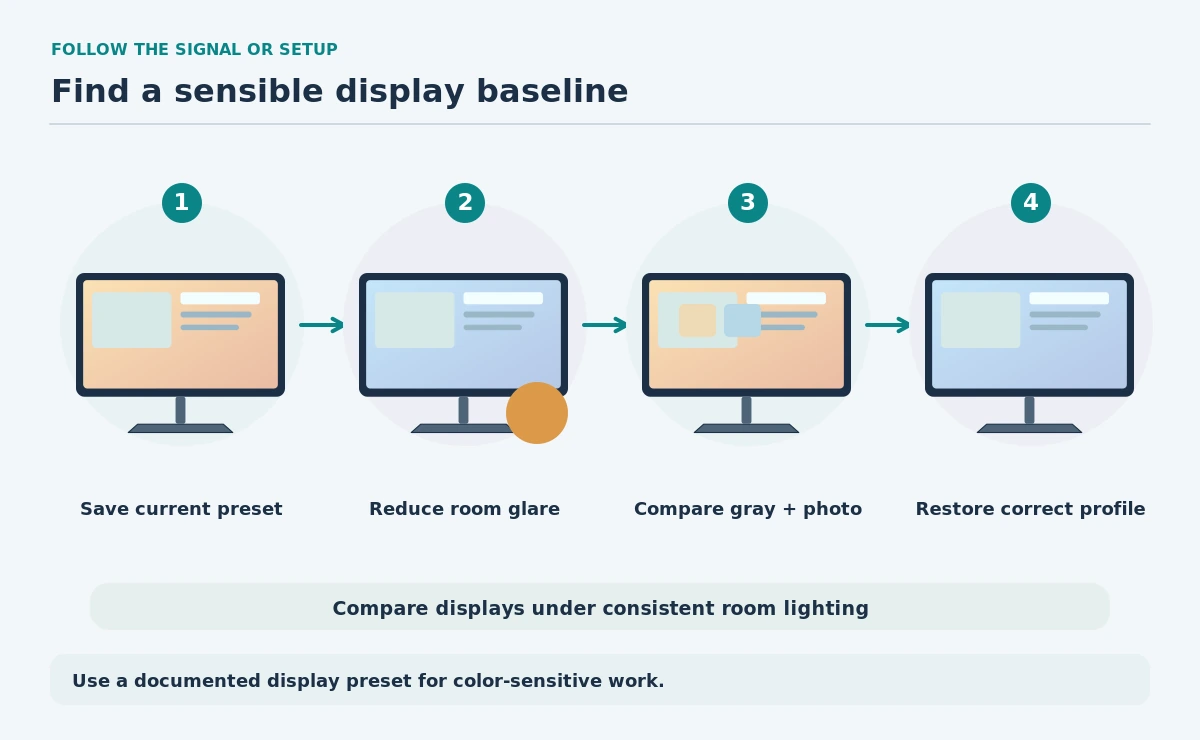
- Save the original monitor preset.
- Stabilize room light and reduce reflections.
- Compare neutral gray, text and a photo.
- Toggle Night light separately from monitor presets.
- Restore a color-managed baseline for critical work.
Choose a setting for the task, not a universal solution
For writing and office dashboards, choose a readable display that works with the room light and does not make whites unpleasant. For color-sensitive tasks, use the color profile, calibrated reference and application workflow your organization requires.
If headaches, blurred vision or other persistent symptoms occur, do not use color settings to diagnose or treat a medical condition. Review monitor distance, lighting and breaks, and seek appropriate medical advice if symptoms continue. The goal here is a practical display comparison, not a medical promise.
How We Research
Our sources include Microsoft’s current brightness, color management and Night light documentation. OSHA’s monitor setup guidance informs the placement checks. This article contains no instrument calibration or eye-health testing. See the HubWin research method.
Sources
Microsoft — Display brightness and color — Explains Night light, scheduling, display profiles and brightness controls.
OSHA — Monitors — Explains monitor placement, viewing clarity and glare control.
No single preset is universally best. Brightness, glare, task and personal preference matter. Warm modes are not a substitute for medical advice.
No. It changes the display’s visible color balance. It does not establish a measured color-accurate profile.
Microsoft notes that Night light may be unavailable with some display drivers, including certain DisplayLink or basic display paths. Check the active driver.
For color-sensitive review, disable temporary color overlays and follow the documented color-managed workflow for the display and application.
No. Reflections come from light and geometry. Change monitor placement or room lighting to address glare directly.